Prof. Michael Bender showed us a neat trick when presenting graphs in talks.
Often, we do experiments with Data-Structures and Algorithms, and we want to show that the cost of doing blah with the foo bar data structure, is $O(n)$ (which means that if we plot the actual cost against the value $n$, we should get a straight line).
Okay. What intuition do you have for something which costs $O(n\log{n})$. I would say its slope is somewhere between a line and a parabola. But how does the audience visually verify this instantly when seeing the graph?
On the y-axis, you do not plot the actual cost, but plot the ratio of the actual cost to the value that you expected, and show that the ratio is constant.
This is how we plotted something that we expected to be $O(n\log\^2{n})$:
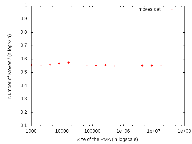
It was perfectly clear that the ratio is almost constant, and hence our hypothesis was correct.